Dynamics GP Visual Studio Tools Toolbar
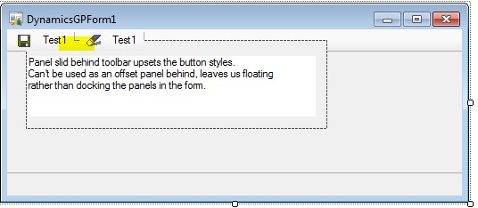
How annoying is it that docking can’t be used when developing add ins for Dynamics GP forms? If a panel is docked it slides under the toolbar at the top but upsets the visual styles such as the separator lines on the buttons.
See below where the panel has been put behind the toolbar, loosing the button effects and toolbar visuals (see highlighted area). The toolbar it seems is painted onto the form itself.
Just one of those niggles. I end up floating all my controls in a container with anchors set for all directions, nothing like as robust as just setting dock>fill.

