Are you a Tab or Enter kind of person
Tab or Enter?
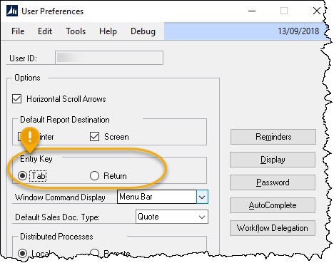
Navigation from field to field on a form in Microsoft Dynamics GP can be performed using the [Tab] key, or if the option has been set the [Return] key on the keyboard.
A quick internet search reveals this ability to change field navigation preference is a standard feature of software such as; Quickbooks, Xero, Quicken, and no doubt most of the other similar products too.
When creating an add-in form for Dynamics GP, don’t forget to support this unless you want user backlash.
Green screen, serial terminals
The first ERP system I used was literally a green screen application, you didn’t have a mouse, instead function keys allowed you to quickly jump around the screen functionality. Navigation from field to field was achieved by pressing the enter key repeatedly until you were at the field you wanted to edit. The field content is then changed and press enter again. When the windows operating system came along, the Tab key became the standard navigation field for moving between fields on forms. My thoughts are that, for those still hard wired in their heads to use Enter key from non –graphical user interface applications, software vendors still supported this, to help the user in the transition to the application running on windows. Perhaps green screen allowed the tab key back then too, I’m unsure, I, like others just used Enter!
Whatever the history is, in GP we can, in the user preferences set this.
I personally have not used Enter as an option since using GP, but curiosity got better of me…
If i query this preference for all users, to find what the users are using, i find,
SELECT COUNT(\*)
    ,CASE
        WHEN MDFRDENT = 0
            THEN 'Tab'
        ELSE 'Return'
        END
FROM DYNAMICS..SY01400
GROUP BY MDFRDENT
Results:
| Count | Setting |
|---|---|
| 122 | Return |
| 59 | Tab |
Looking at the figures, it seems users prefer to use the return key. This might not be the whole picture, many users may not even realise they can change this preference, the user default in our case set to Return. Tab is the windows default for navigation, so are we setting our users up for digital failure in their lives outside work, where they find they can’t use the Enter key? For example, on the internet, in browsers, we find that the Enter key will normally submit a form.
Behaviour
There is data saying that only 10% of regular (non geeks) tab between forms, the sad truth is the rest leave the keyboard, grab the mouse click, then return to the keyboard. [1] Even worse studies show that users arriving at a form, even though the cursor is blinking in the first form field that they want to fill, will still grab the mouse and set focus on that already focused field before typing -ugh!
It seems that the standard user just doesn’t value speed or ease in their interaction with the device they spend most of their day in front of. Most of us know users will rarely invest the time up front to learn how to use an operating system/application properly, even when it could vastly improve their efficiency, they just don’t value it.
The keyboard power user
While we are talking about this kind of thing, there is another kind of user worth mentioning, rare to find but amazing to watch in action. In my experience, they tend to be an older user, brought up on green screen technology. These users don’t leave the keyboard, in fact they raise a big sticking objection if the form tab order is not correct and if they can’t do everything without the mouse and with shortcut keys or key chords. These users use the application like they are playing a familiar song on the piano, using muscle memory to enter data a lightning speed, without taking a breath (grabbing the mouse).
Enter vs Return key
After all that we remind ourselves that the Enter key and Return Key are actually two different keys that once did different things, look at your numeric key pad for enter and big button for return…


